As some astute readers of my blog may know, I'm an avid reader of CFA Institute's Enterprising Investor blog. I thought I would borrow a cool idea that one of their content providers started doing a couple weeks back. This investor basically saves all the charts and pictures he comes across each week and then posts them with a few short comments. Since this is my first post, the charts are from the last several weeks prior, but I will try to regularly keep this up in the future (hopefully each Friday).
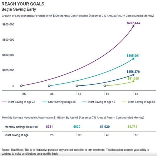
The first chart comes from Blackrock and shows the power of retirement saving from an early age. Specifically it shows how much one has to save per month at various ages to accumulate $1MM by age 65. Keep in mind this chart assumes 7% annual returns compounded monthly. With a well-balanced portfolio I think that's pretty achievable.
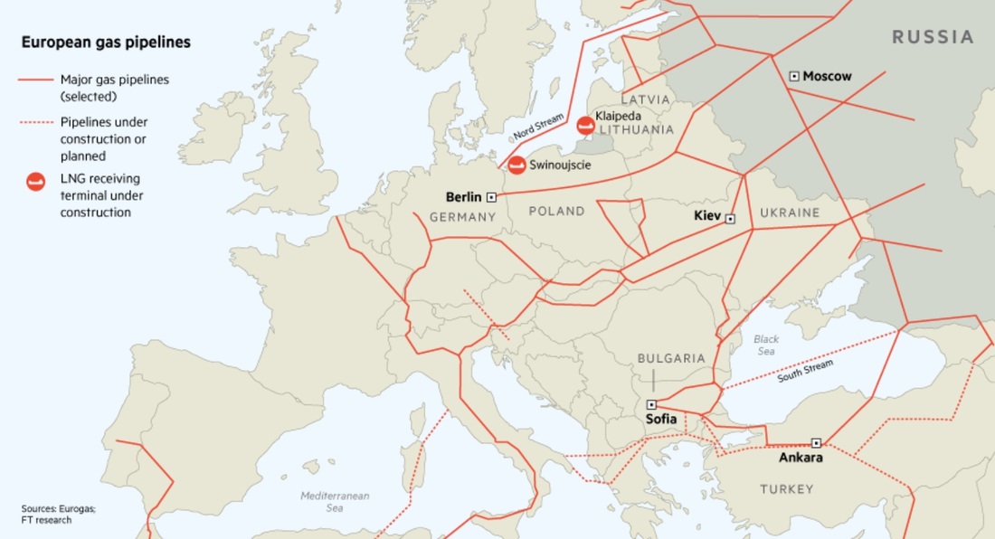
I love maps and this map from the Wall Street Journal details Europe's gas pipelines. As one would expect, Europe depends pretty heavily on Russia for natural gas. Given the crisis in Eastern Ukraine hasn't subsided, Europe has started to increase its diversification process for the fuel.
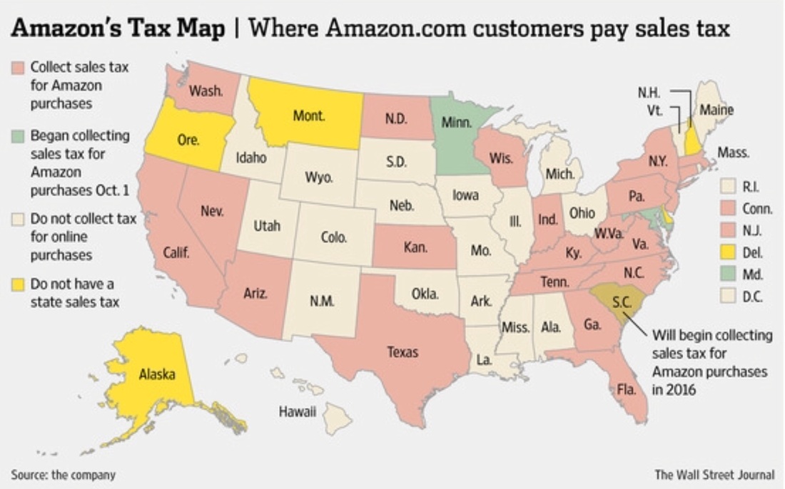
The next map is also from the Wall Street Journal and shows which states have to pay sales tax when they order from Amazon.com. We're pretty lucky here in Ohio! I also believe this chart has changed slightly since it was originally published in the fall of 2014 as I'm pretty sure Illinois is collecting sales tax on Amazon purchases now. Good think I moved haha!
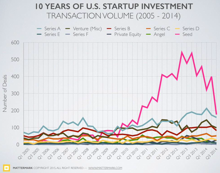
The next photo is courtesy of Mattermark. It shows the last 10 years of startup investment by TRANSACTION VOLUME, NOT DOLLAR AMOUNT. It's interesting though as valuations continue to skyrocket because although the number of deals have gone down, I'm almost positive the dollar amount keeps increasing. I will be on the lookout for a chart detailing that in the coming weeks, but for now suffice it to say that seed deals are starting to slow significantly. Can't wait to see what happens when the Fed starts raising rates!
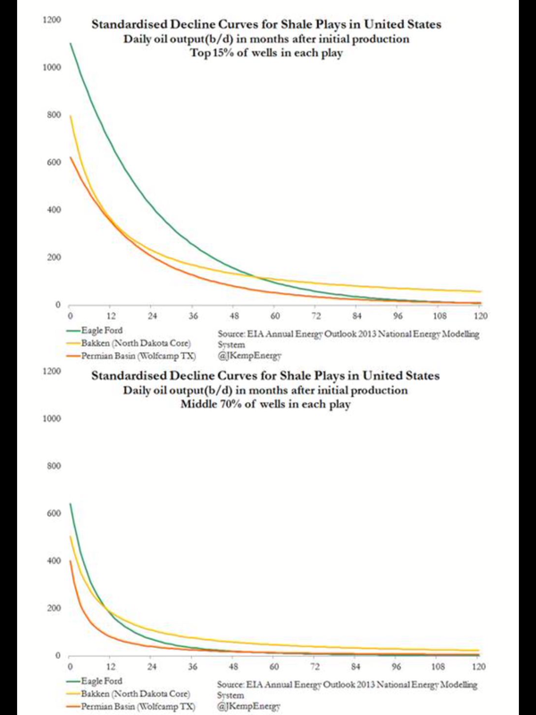
I think this chart that I stumbled upon on Twitter should be scrutinized by all bulls on US drilling activity. It basically shows how quickly shale plays in the US deplete after initial drilling. The top 15% of wells in those plays decline a lot slower than the middle 70%. Will be very interesting to follow in the coming years as US drillers continue to pump for oil and gas. Maybe Saudi Arabia was smart in continuing to produce...they are basically calling the US bluff.
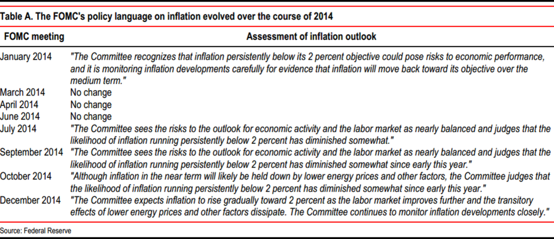
The above chart from the Federal Reserve shows how the FOMC's assessment of inflation changed over 2014. It's important to note that they think the decreases in the price of oil and other energy prices are transitory in nature. To me, I think this shows that the Fed doesn't necessarily have to raise rates any time soon.
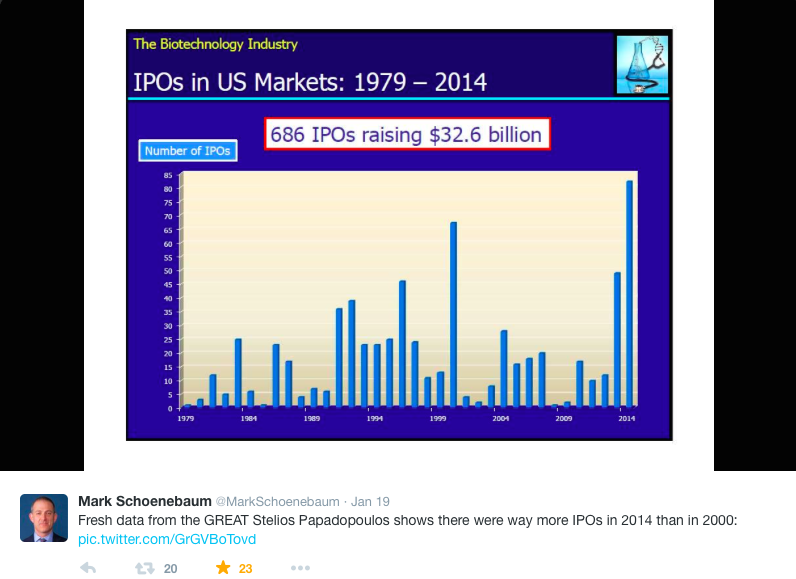
Mark Schoenebaum is probably the best healthcare analyst on the sell-side (he works for ISI) and he recently tweeted this picture of biotech IPO volume dating back to 1979! The astute reader will ask if 2014 is a bubble or if something has changed. It's tough to say, but I would also argue that since mapping the human genome has become so cheap (by historical standards) that biotech companies can now target diseases and personalize treatments to make drugs more successful making drug approvals occur at a higher rate. Now on the flip-side every biotech company that has gone public doesn't have a drug that's approved yet, but many do. The others probably want to get relatively cheap financing while the biotech market is hot and rates are low.

The last picture I wanted to post was my old twitter picture because for whatever reason I find it hilarious. Google Hangouts allow you to put these hilarious accessories over your video chat when talking with friends or family. I highly recommend trying it out! Hope you enjoyed the first weekly installment of "Charts" and until next time...
 RSS Feed